Many people think having signage that is ADA compliant means that it includes braille for those who are vision-impaired. While braille is certainly a more recognizable characteristic of an ADA-Compliant sign, there are other regulations and factors that businesses should be aware of to ensure their signage is compliant with ADA regulations.
Here are five factors that should be considered when creating ADA-compliant signage:
-
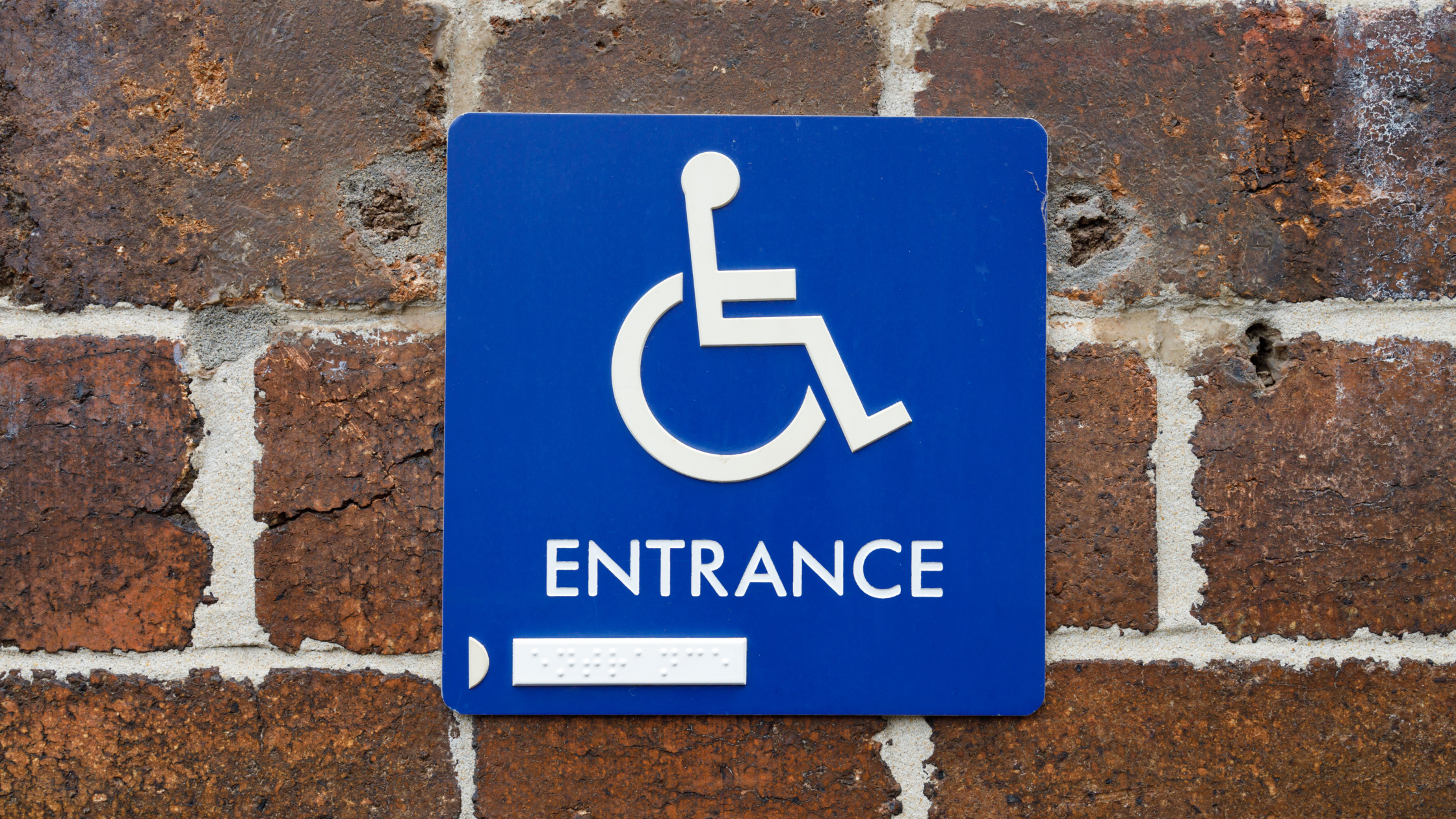
Color Contrast
High contrast colors are key to readability. When characters blend into the background, they can be difficult to read - especially red and green colors for those who may have color deficiencies or color blindness. To meet ADA requirements, 70% contrast is recommended (though not required or outlined in the ADA Standards for Accessible Design.) This is why many brands often use white characters on a black or other dark background, or black characters on a white background. Either way presents a very high contrast. -
Finish
Glares and reflections can be difficult for vision-impaired people to process. This is why one requirement for ADA signage is that it is a non-glare finish. Matte or eggshell is best to reduce glares. This ensures that signage can be read with ease. This is a basic requirement for INDOOR ADA signage. Outdoor signs are not required to follow this rule. - Font & Characters
Using appropriate fonts and characters is also an ADA requirement. This allows for the sign to be read by anyone - including anyone with vision impairments. There is a list of ADA-compliant fonts - specifically sans-serif fonts - that are as plain as possible. Examples of these fonts include Verdana, Helvetica, Open Sans, and Futura. Characters should not be highly decorative or in other unusual forms. Other factors such as case, spacing, and size are outlined within ADA Guidelines. - Mounting
The way a sign is mounted matters however location matters just as much, especially for room-identifying signs. Signs should be adjacent to the door so they can be located by people deemed “functionally blind.” They should be a minimum of 48 inches and a maximum of 60 inches above the floor or ground surface. - Braille Text
Braille elements allow those who are blind or have other vision impairments to navigate a building easily. ADA Guidelines require any sign identifying a permanent room or space to have braille text. These guidelines also outline requirements for the dot bases and distances between dots.
When it comes to creating signage, understanding the ADA standards ensures your signage is compliant and user-friendly for ALL users. With this information, you can work with your paint supplier or sign fabricator to ensure all requirements are met.
Back painting acrylic to create ADA-compliant signs is a common use for custom spray paint by MyPerfectColor. It enables the sign fabricator to match the brand colors of their clients while using readily available clear acrylic materials.
Need a quote for spray paint that will help your signage meet these requirements as well as be on brand? Get in touch with us.