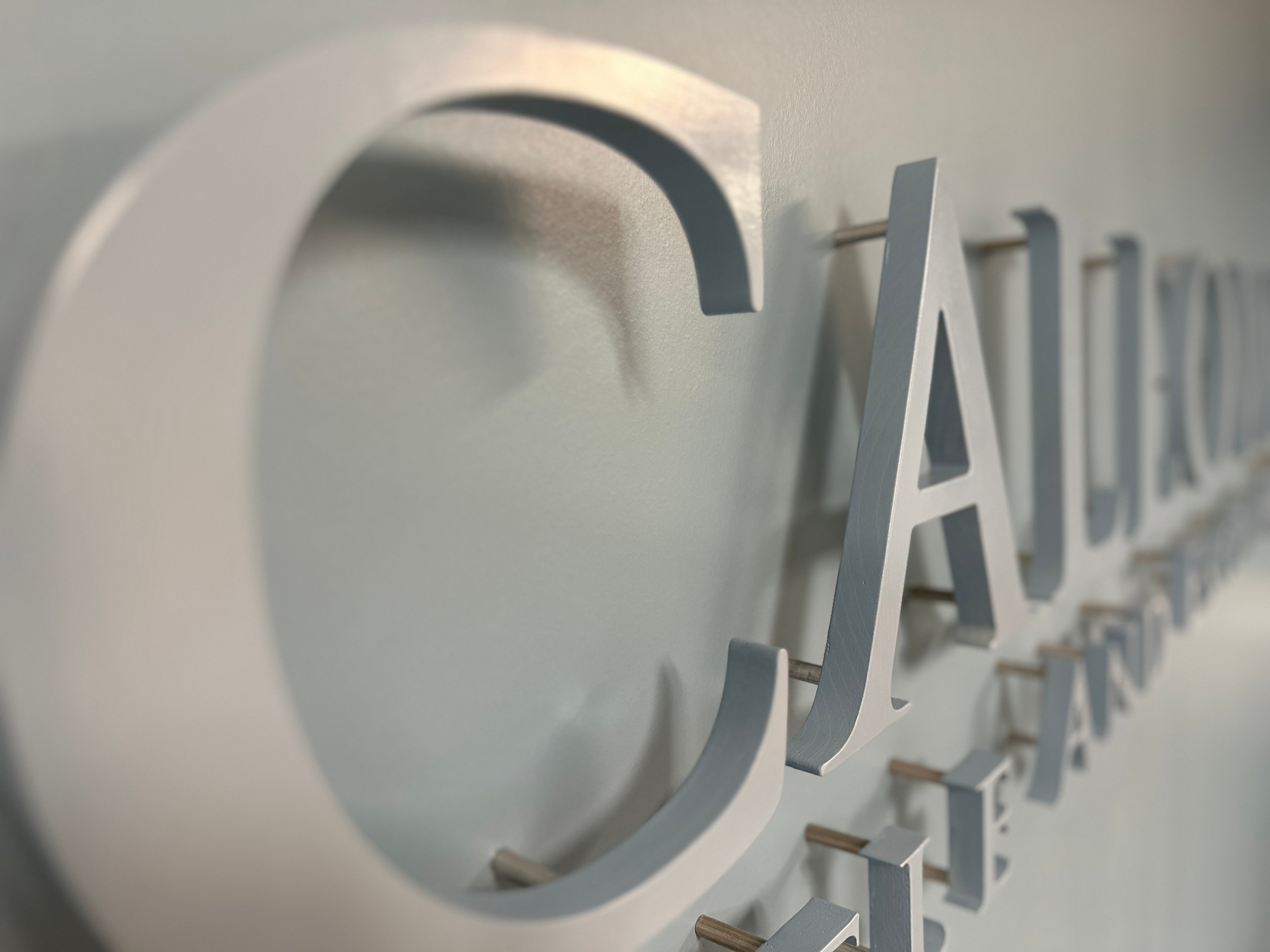
We love customers sharing their projects with us - from larger corporate trade show displays, to in-office signage, projects can come to life with the perfect color match.

We love customers sharing their projects with us - from larger corporate trade show displays, to in-office signage, projects can come to life with the perfect color match.
Topics: Spray Paint

You see them all the time, you know, the shimmery coatings on surfaces and products. Those metallic paints can be useful for coating anything from furniture, to mountain bikes, to automobiles. These paints tend to add a luxe shimmer to a surface that is appealing to the eye.
Topics: Spray Paint, touch up paint
.png?width=2240&height=1260&name=MPC%20product%20color%20(1).png)
Consumers typically make up their minds about a product within 90 seconds of the initial interaction. Appearance is often the main deciding factor in choosing to purchase a product or not. This makes color a crucial factor when it comes to product design.
Topics: Spray Paint, touch up paint
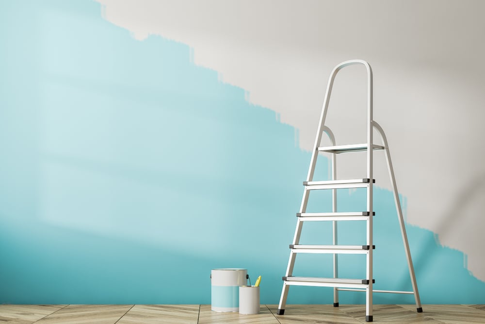
Have you ever seen a scratch or a hole in your wall and thought - maybe I could just touch this up? Many customers are looking to touch up their walls with either sample paint (which we don't sell) or quart-sized paint simply because it's an inexpensive solution. We do not recommend this.
Topics: Paint Tips
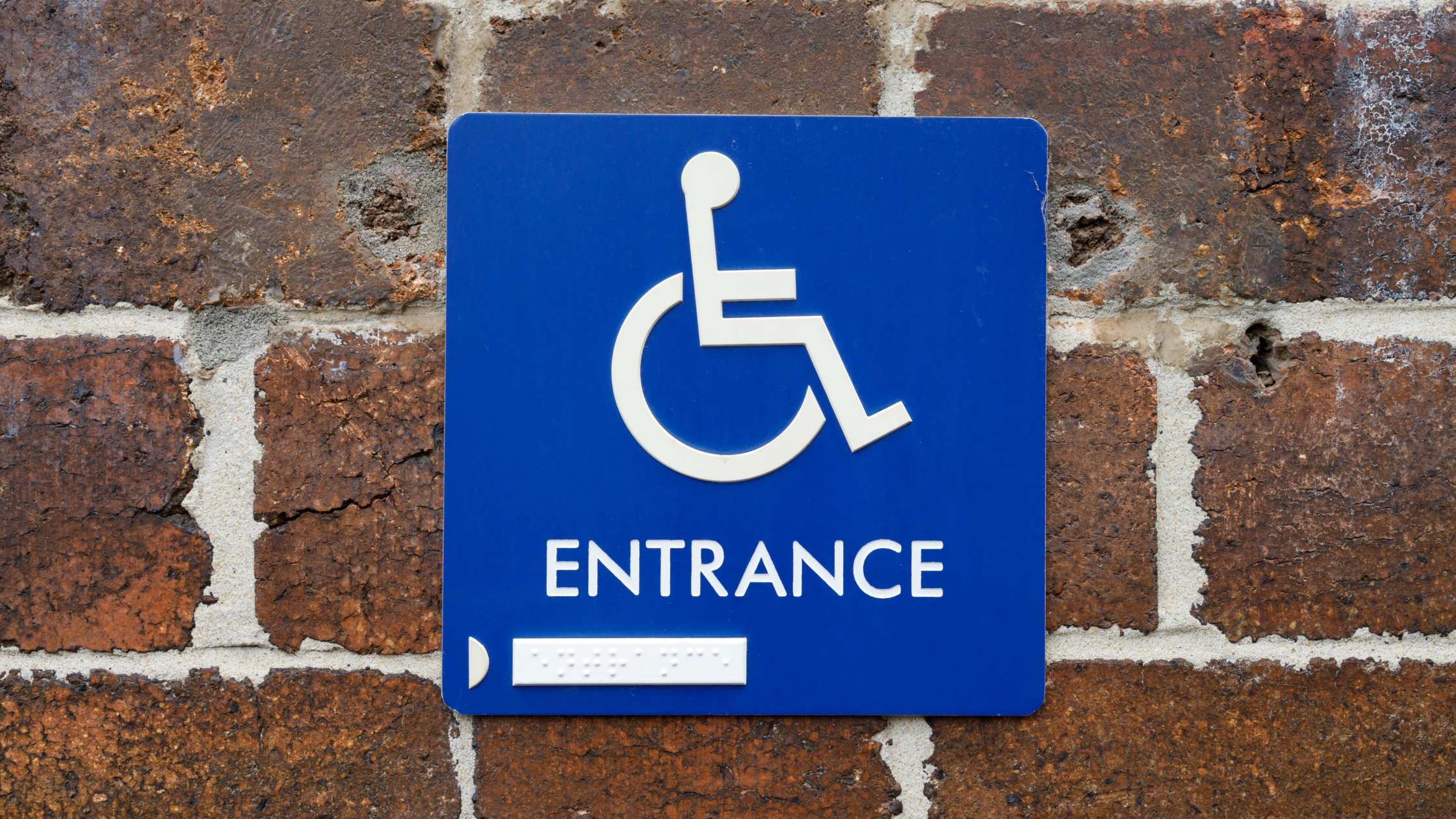
Many people think having signage that is ADA compliant means that it includes braille for those who are vision-impaired. While braille is certainly a more recognizable characteristic of an ADA-Compliant sign, there are other regulations and factors that businesses should be aware of to ensure their signage is compliant with ADA regulations.
Topics: Spray Paint
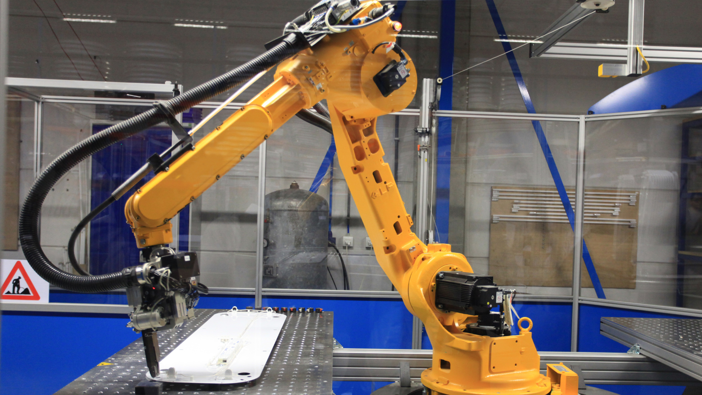
When your product fails to meet company standards, it needs to be repaired, better known as manufacturing rework. Reworking can cost companies millions in increased operational costs, wasted materials, wasted time, and cranky customers.
Topics: touch up paint
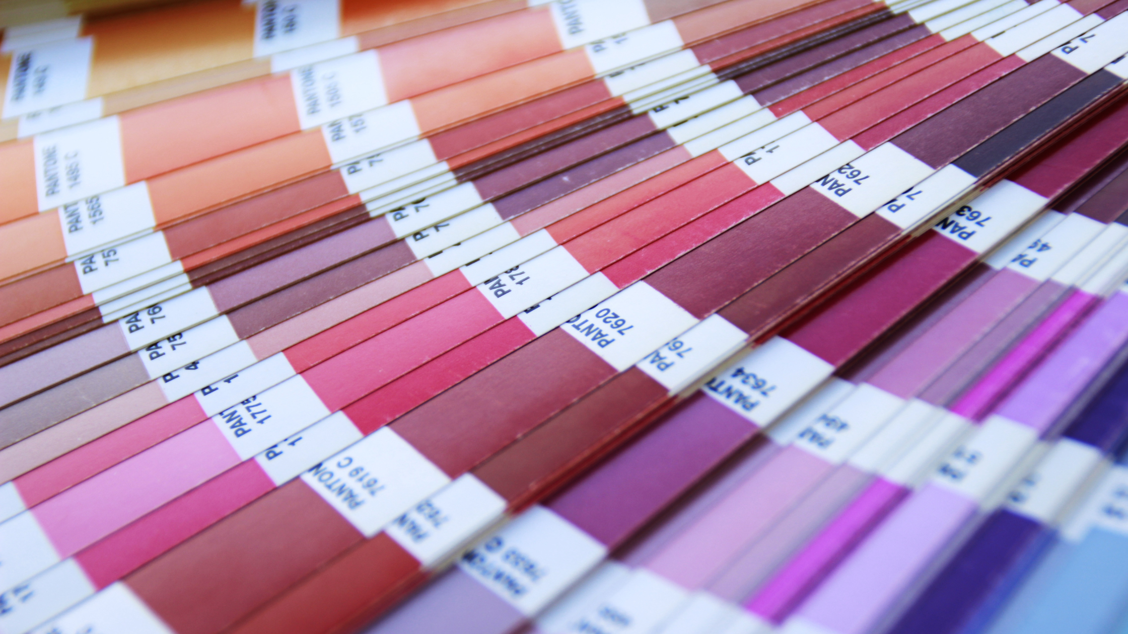
So your product got scratched, and you want to touch it up. It happens, we know. Many businesses – especially manufacturers – will specify Pantone color codes for touch up. So when we tell customers, not to buy a Pantone color for touch-up paint, they’re confused. They think, "but the large reputable manufacturer told me the exact code?”
Topics: touch up paint
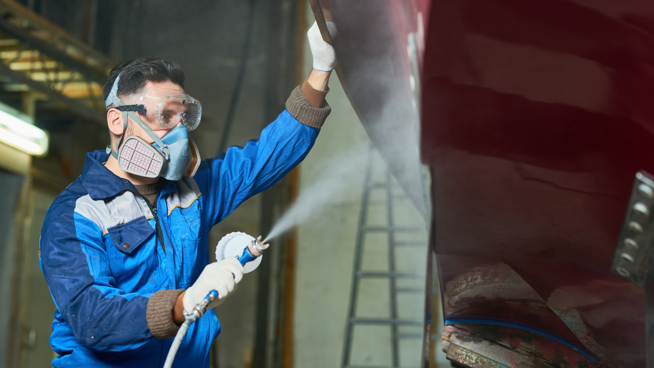
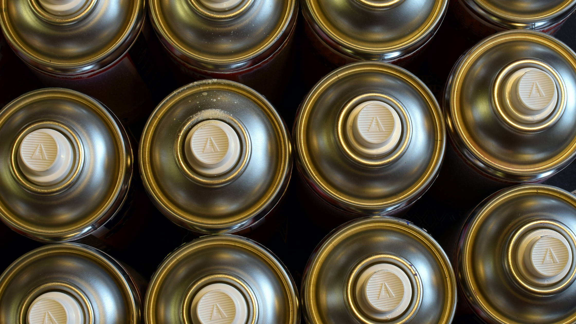
There are hazards to using spray paint in any environment. In a business setting, there are a number of factors that need to be considered when choosing where and how to spray paint so that it’s safe and effective. Here are some safety techniques for spray painting indoors and outdoors.
Topics: Spray Paint