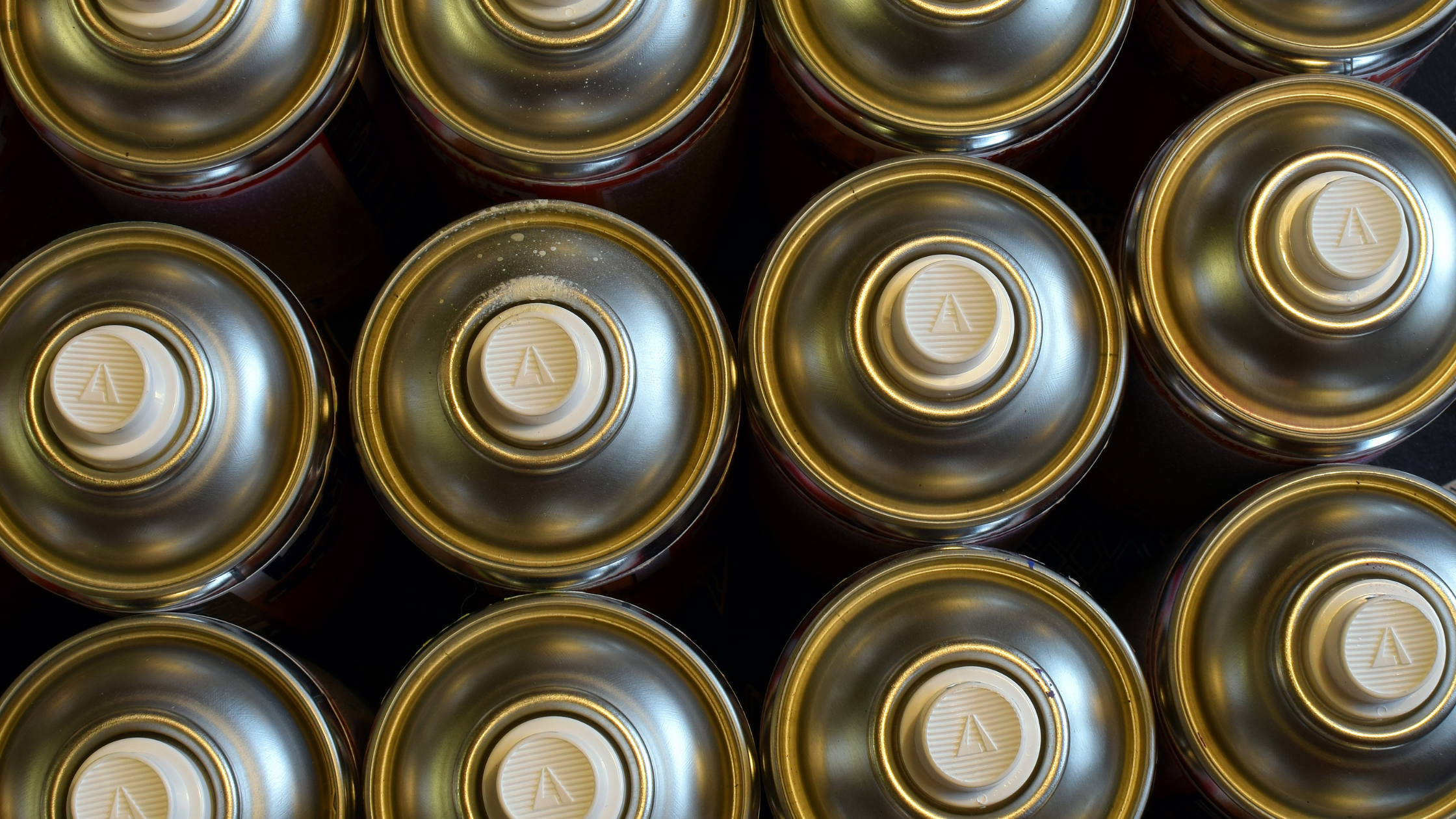
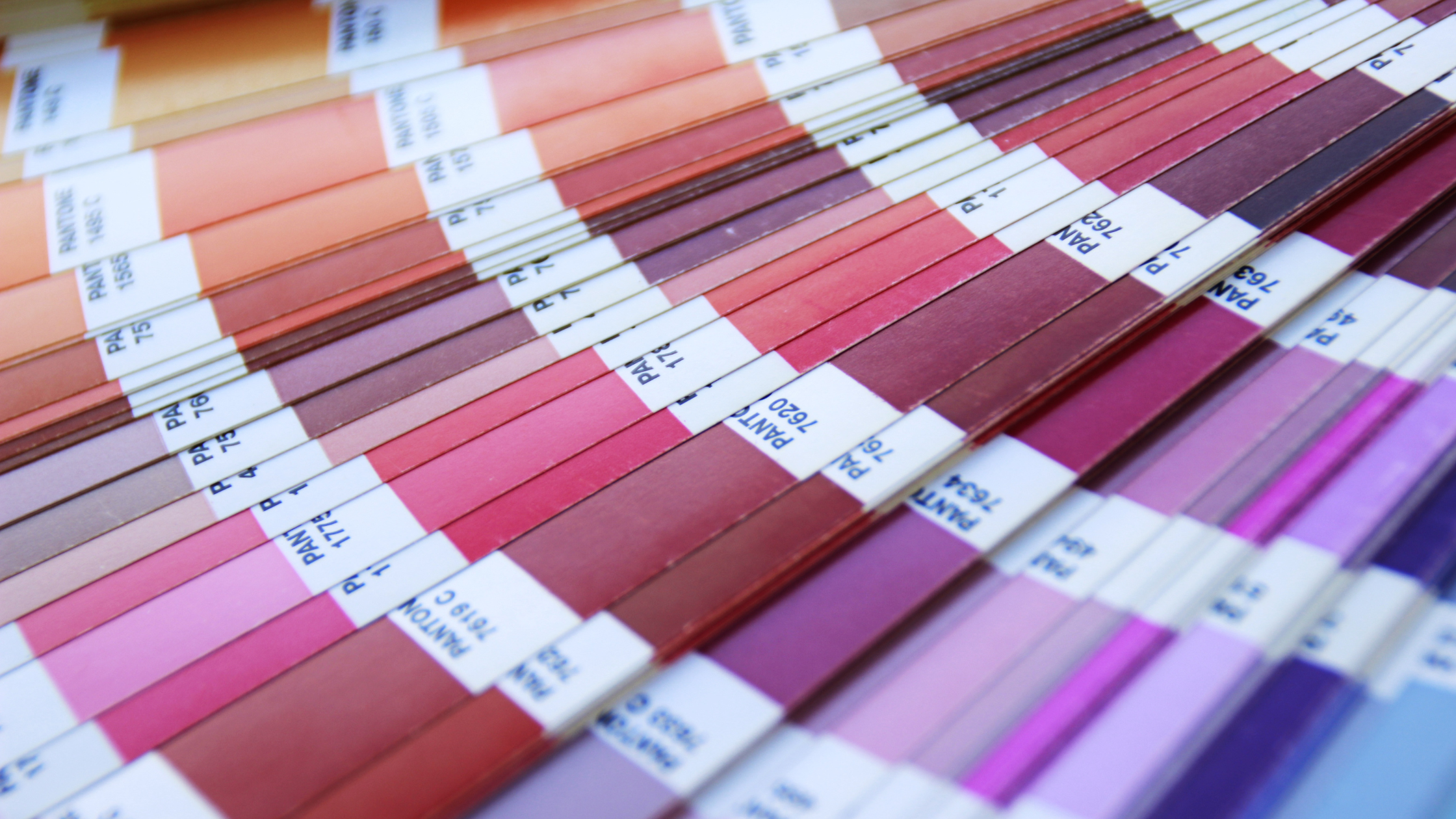
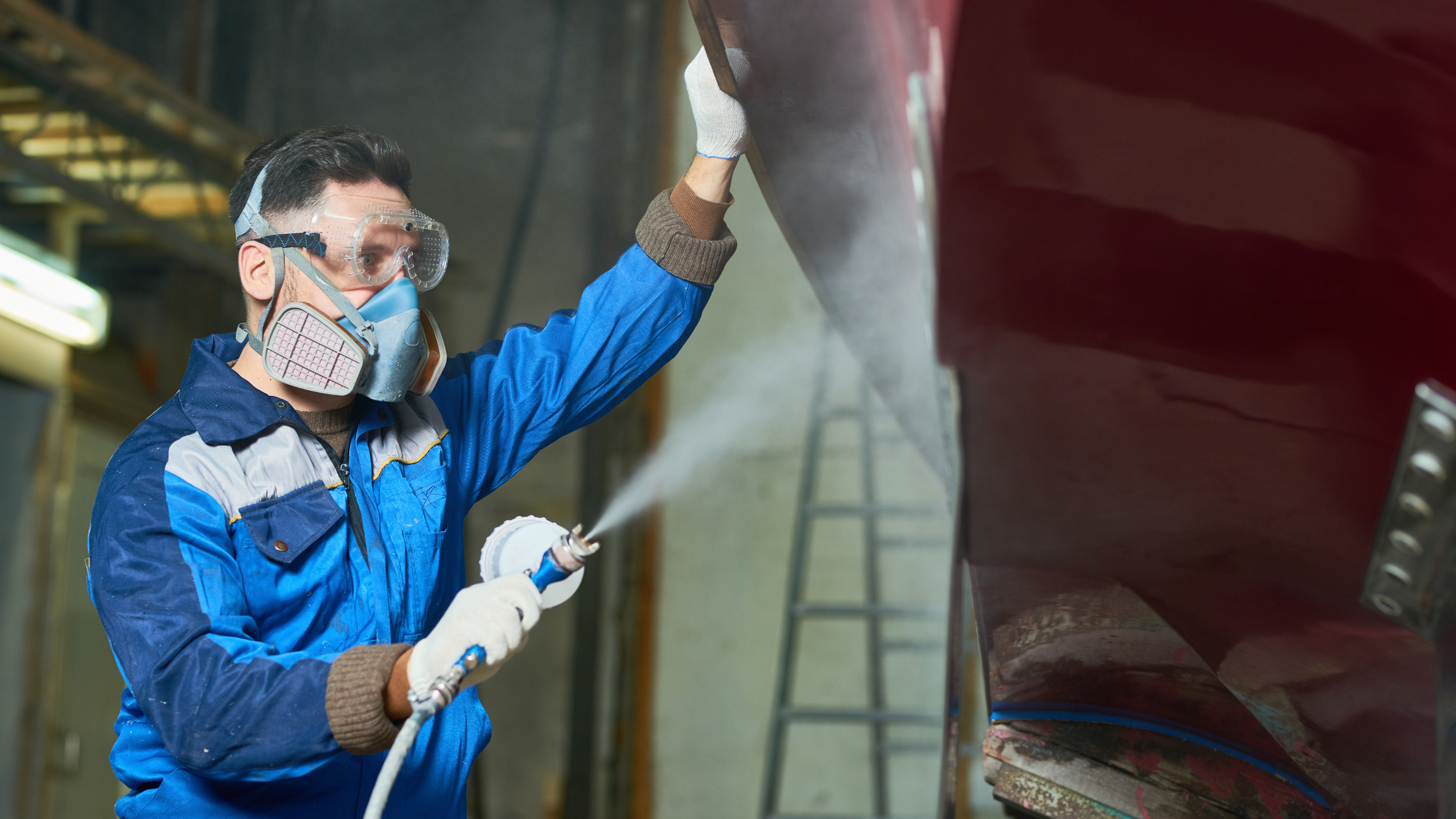
|
|
janelle posted this in house painting, paint colors on June 11th, 2009
With gray being all the rage right now, one of the easiest ways to integrate gray into your space is through paint (of course!). Not only is gray in style for both fashion and interiors, it’s a neutral that is soothing and calming. Just like other neutrals such as beige, brown and black, gray can be paired together with a myriad of colors to create a hip, classic or modern palette. To read more on other colors of the moment, visit this post.
Here are a few grays that are right on the money. The last one, Balboa Mist looks like its a tan, but its really a soft gray that goes especially well with White Thassos and Cararra Marble:
Stone Harbor 2111-50
Smoke Embers 1466
Stonington Gray HC-170
Balboa Mist OC-27
Also, check out Gray Owl OC-52 (photo unavailable)
faithsheridan posted this in paint colors on May 24th, 2009
It’s fun designing with young families and little girls. No grandchildren yet for me so I can live vicariously and design with them. I am fascinated by the attraction to pink and how to integrate it into a scheme.
These are some of my favorite pinks at the moment…
 Ribbon Pink 2087-60
 Please Leave Pink
 Little Piggy 2008-60
 Red Tulip 2003-30
*******************************
What I am loving now is Phillippe Starck’s Louis Ghost Chair for Kartell launched in limited edition version to celebrate the birthday of another icon. This is the 50th anniversary Barbie Ghost Chair.
As you would expect from anything Barbie related, the chair’s transparent finish is in pink, and it has a hand-illustrated Barbie image and logo. The chair comes in the smaller child’s version, the Lou Lou Ghost Chair, which is a great option for design-conscious parents.
It’s amazing how something as simple as a pillow can completely change the look of a room. For a splash of color, use a variety of throw pillows and floor cushions in your child’s favorite pink solid colors and interesting patterns.
 Suzette Pink Pillow
Few tasks can be as delightful — and as daunting — as creating a room for your child. Since you’re reading this article, it’s clear your child’s happiness and healthy development are high on your list of priorities. Whether you are decorating and furnishing your firstborn’s room or are making a special place for later arrivals of any age, you know every child is a magical, unique individual who’s constantly evolving. And their special spaces are constantly evolving, as well — from cozy baby nurseries to colorful playrooms to walls of teenage self-expression.
I had a client ask me, “Why do pink and brown look great together? How does it work so well?” Why would it work so well; pink is so girly and brown is just boring?
Let me explain. . .brown is a sign of strength and dependability - Benjamin Moore’s 2110-30 Saddle Soap or BM1035 Cambridge Riverbed. The beauty of the earth’s rich soil, the bark of your favorite large tree to hug, these are examples from earth that bring us comfort. Now share that space with a solid peony pink or a magenta, and you’ve got glamour and dazzle! Example BM2080-40 Wild Pink. Then pull it all together with a soft trim color such as Benjamin Moore’s HC-93 Carrington Beige.
This color combination is thought to be a fit for a sunroom or girl’s room, but why not a master bedroom? With luxurious fabrics of raw silk and velvet, you have brought touchable textures of romance together. Its a balance of masculinity (brown) and pink (feminine). A pink magenta is not girly, it’s a subtle power to harmonize with the earth’s brown! And that’s the why and how - give romance a try!

- 2110-30 Saddle Soap

- 1035 Cambridge Riverbed

- 2080-40 Wild Pink

- HC-93 Carrington Beige
One of the most interesting periods in design history is that of the Biedermeier era which had its roots in 19th century Germany and Austria. It’s also one of the most unknown and overlooked period styles amongst many people, both with experts and the general public alike. So how did this style come about and what colors could one use if designing an interior space related to this period?
The Biedermeier era is considered to have started in 1815 and come to a close in 1848. It was very much an Austrian and German phenomenon which corresponded with the Regency style in England, Federal style in the United States and to the French Empire style. It wasn’t just design that was the focus but also literature, music and fine arts.
Two channels of societal change were taking place during this period which led to the popularity of Biedermeier styles and designs. One was the growth of urbanization and industrialization which led to a larger and more wealthy middle class. The other was the growth of political oppression following the completion of the Napoleonic Wars. This latter movement led to the domestic environment taking more of a center stage and an increased focus on the non-political subjects of the day.
When it comes to interior design and furniture in particular, it can be justifiably said that the Viennese craftsmen of the early 19th Century were the innovators of Biedermeier-style furniture. In some ways inspired by the French Empire interiors which were characterised by solidity and Classical shapes, the Biedermeier look evolved to a more simpler format. Furniture became simpler and did away with the intricate designs. The rest of the interior design also followed suit. Floors were usually bare and walls were painted in pale or bright colors with the avoidance of complex paint finishes.
If you come to design a Biedermeier interior in your own place of residence, then the colors to consider would definitely be clair bois (pale wood) with a black ebony inlay. This can be achieved on doors, window frames and with furniture pieces. Any of the major wood types are suitable including birch, maple, ash, cherry and even pear.
For the walls it’s best to try and maintain a light ambiance to the room. This can be achieved using soft and creamy colors. You might look at Bavarian Cream, Cream Caramel or Lemon Cream. Alternatively, if you want some flamboyance, you can try more vibrant colors that will contrast with the pale woods. Try a Sun Kissed Yellow or even, if you’re very daring, a Glowing Turquoise. The yellow in particular can be matched with black and gold fittings and decorations to avoid the complete domination of the yellow walls.
janelle posted this in house painting, paint colors on April 23rd, 2009
I would like to tell you the story of the perfect peach paint color. After Mr. Wonderful and I were married here in Southern California, we took off to Las Vegas for a stand-in honeymoon. You see, I requested Carpi, Italy- but since my husband was finishing his last year of his undergraduate accountancy degree, we couldn’t take the time to go international in October (the month of our wedding, of course). So, he booked us the next best thing to Italy in the United States- a suite at the Venetian in Las Vegas.
After the huge production that started at sunrise, a whirlwind of friends and family, a fantastic wedding and reception and a four hour car drive spent talking about our memorable day- you think I would have been too exhausted to think about interior design, right? Wrong. After checking in, the first thing I noticed when we got to our house-sized digs was the paint color in the bedroom. There I was, a young bride in a gorgeous hand-beaded gown, on my wedding night, basking in the glow of the peach paint- inspecting it, turning the lights off and on to see how the color changed, and marveling that I was falling in love with peach- of all colors!
I fell hard for what I like to call Venetian Peach. And that’s coming from a girl that grew up in the eighties, where the wrong shade of peach mixed with sea foam green left a sour impression on me. Not a day went by that I didn’t comment on the peach in the bedroom.
I started having all these sentimental fantasies that I would paint our bedroom in our first house this lovely shade of Venetian Peach- undoubted, I would have the best back-story to my (future) bedroom paint color. It got to the point where Mr. Wonderful told me I should just ask the concierge if they could tell me the color so I could forget about it.
During that stay, I decided that peach was the most flattering color for a bedroom. Its not pink and its not boring beige. Its sort of gender neutral, at least its more gender neutral than pink would be. Most importantly, it just makes everything glow. Peach really works magic on skin tones. And the light in a peach room is warm, lovely and soft.
I made up my mind that I would schmooze with the concierge before we left. The Venetian is a world-class hotel- I was sure they would find me the paint color if I asked. Mr.Wonderful said only I would do this, and on our makeshift honeymoon to boot! Imagine our serendipitous timing when we checked out a few hours earlier than normal on our last day…the painters were in the suite next door! I couldn’t help but think it was meant to be! I poked my head in and coyly asked if they could tell me the paint color.
One of the painters literally stopped what he was doing and trotted over to the paint bucket. It was unmarked (well- the brand was marked, but that’s it!). He told me he was sorry, the color was not listed. Then, as if a light bulb went off in his head, he ran over to his spraying shield (a card board box) and cut off a piece of the board. He then made me a paint swatch out of the paint! I just about died. Here, in my hand, I had the most beautiful paint color in the world. I couldn’t believe he did this for me- I was just giddy. All the while, Mr. Wonderful just stood there- holding our bags, shaking his head with a half-smile in disbelief, “Is my wife really doing this right now?”.
That is the story of the perfect peach paint color. And now, here are the best matching Benjamin Moore equivalents to my keepsake paint swatch. I always recommend testing paint colors in your space. Click here to order small samples for testing.

Winter Melon 093
Delicate Peach 120
Florida Seashells 128
homeinteriordesignthemes posted this in paint colors on April 14th, 2009
The Moors came from Africa and established a kingdom in southern Spain. Mainly of Arabic and Berber descent, their cultural designs have inspired designers centuries later. The mystery and romance of the Arabian Nights and the splendid palaces, arches and furnishings seen in museums and buildings throughout the Mediterranean world, still lend themselves to Moorish themed bedrooms and hallways in modern homes.
If you are wanting to create an interior in this style then you will find it most helpful to read the following tips of mine regarding color schemes and decor.
The colors that were most common in Moorish buildings in the cities of southern Spain were shades of the primary colors red, yellow and blue. A deep, slightly browny red, an orange-tinted yellow ochre, a vivid pastel blue, a deep intense blue and a deep emerald-green.
For larger walls or floors then soft pastel tints of these colors are most appropriate rather than the more overpowering pure colors mentioned above. The strong colors can instead be used in painted patterns (wall stencils), furnishing fabrics, decorative art and any other small details.
To add a modern theme to the Moorish interior, whether a bedroom, living room or kitchen, it’s a good idea to add some steel furniture whether a sink or a chair. Monochrome items will contrast well with the vivid colors. Trinkets, jars, picture frames and candlesticks in burnished copper and brass intimate the rituals of prayer during that period. Think about North African patterned rugs as well especially those with red sections, depending of course on the rest of the color choices.
Terracotta must be a part of the overall Moorish design. A terracotta-effect wall look can be easy acquired using certain paint finishes. Floor tiles or decorative sculptures made of clay or imitation materials, can add further to this theme. Plant pots in this style can also work wonders.
Traditional Moorish patterns can bring the colors used to life in rugs, carpets, doorway arches and on walls. Many books are available in good bookshops and online where these patterns can be studied and copied. Complex geometrical shapes and interlocking polygons woven with stylized floral patterns and arabesques were the most common designs and will are the types of things you will need to look for.
With a little planning and the right colors and paints, your Moorish themed room will be a delightful space in which to entertain guests or admire whilst reading a book on a quiet Sunday afternoon with the setting sun shining onto the warm and rich Mediterranean colors.
Jason Shaw posted this in hunter douglas on April 2nd, 2009
The importance of window treatments to the interior beauty of your home cannot be overstated. After all, all we see is light and light reflection, so controlling the light in your home is an integral part of creating your decor.
Although controlling the light coming into your home is just one of the benefits. Window treatments can also allow you to bring the beauty of outdoors into your home by providing the best possible view-through with your blinds or shades.
Some think that view-through is one of the most essential elements to consider when choosing window treatments. Great window treatments will both allow controlled light into your home and also allow a view of the outdoors. Nothing breathes fresh life into a room like a gorgeous view of the outside. Window treatments offering view-through make this possible. So be sure to keep this element in mind as you consider the best window treatment for your rooms.
The following explains the types of view-through available, from clear to translucent to opaque. Hunter Douglas window fashions offer a full selection and variety of colors, styles and controls.
Clear View
Window treatments featuring shutters, shades or slats offer the opportunity of a fully clear view. Slats or shutters that tilt allow you to change the slat positions to optimize the light for various times of day. For example, you can maximize the morning sunlight and them reduce the light coming in when it becomes hotter later in the day by tilting the slats to reduce the direct sunlight. But because you are dealing with slats, they will not block your view so you can still enjoy the light and a view. Hunter Douglas offers many different kinds of blinds with slats and louvers.
Translucent View
Translucent views enable a beautiful glow of diffused light within the home. Window treatments such as sheers can achieve this type of light control. And not only do they look beautiful, they allow soft filtered sunlight into your living space which reduces direct sun glare and provides a soft relaxing feeling. Yet most impressive, these Hunter Douglas sheers enable you to see the outside world with a soft translucent view. Various sheers offer differing degrees of view-through and light control, so check with your local Hunter Douglas expert to find out the best window treatment for you. The right fabric for you depends on several factors such as window position relative to the sun.
Opaque View
Louvered products and blinds tilt to block out both the sunlight and provide privacy. No one wants anyone to be able to see into their bathroom, so privacy is the main concern. However, the nice thing about tilting products is that the level of view-through and privacy is completely up to you. You change it to whatever you want whenever you want it.
dhtimmons posted this in paint colors on April 1st, 2009
Finding the right paint color to get from For Sale to Sold!
Conventional wisdom dictated for years that when you sell your home, the first thing you need to do is paint all the walls white. I sold a home in California several years ago, and the first Realtor that wanted my listing told me over the phone that, sight unseen, I needed to paint all the walls white. No exceptions. Luckily, I found a wonderful Realtor that came out to my home and declared that the beautiful wall colors would enhance the prospect of a sale, not detract. The home sold the first day, with multiple offers, and there was not one white wall in that house! Thanks to the explosive interest in networks like HGTV and DIY, home buyers are more sophisticated, and expect a home to have distinct personality. I’ve worked with countless homeowners to choose the right paint color to enhance their home, and put their home at the top of a buyer’s short-list.
I’ll share with you some of the the tips that I give my clients for getting their home in sell-ready shape!
Less is definitely more. Unless the wallpaper or wallpaper borders were put up in your home in the last five years, you may want to consider removing them. If you have a lot of wallpaper, or are not sure if it looks dated, ask your Realtor or a good friend who will be honest, if the wallpaper dates the house. While removing it can be a pain, not removing dated wallpaper can turn buyers off. Buyers don’t want to remove it either. Some painters can successfully paint over wallpaper, but this is best left to an expert to decide if it’s possible. While you’re at it, take a hard look at your window treatments, too. If your fabric valances were put up around the same time as your wallpaper, it might be time to retire them, too.
Variety is the spice of life, up to a point. Enhancing a home for sale by adding or changing paint is more than just choosing a beige paint and coating every wall with it. Too much beige begins to look like too much white, but too many paint colors throughout your home just looks like too much. Choosing buyer-friendly paint palettes gives you a chance to capitalize on your home’s personality, and even soften your home’s flaws. You’ll want to keep your palette somewhat small when selling your home. Choose a unifying neutral for your entry, halls, and several rooms. The goal with your pre-sale paint makeover is to appeal to the widest possible audience, and at the same time do everything you can to prevent disqualification. For your neutral, unifying, color try these:
 |
 |
 |
| Natural Cream |
Fairmont Lobby
Cream |
Oat Straw |
A colorful welcome. A welcoming front door puts buyers in the right frame of mind for touring your home. Now it not the time to drag out a left over can of paint from another painting project. Treat yourself and your door to a fresh and beautiful color. Try these colors above your welcome mat!
 |
 |
 |
| Pomegranate |
Himalayan Paw |
Marlboro Blue |
Reconsider the red dining room. Red has been a popular color for the last several years, because it makes a bold statement in the one room you expect a bold statement! There are many gorgeous shades of red in dining rooms across your town. If you have not already indulged in a red dining room, consider something different. Chances are, after a buyer sees numerous homes with red dining rooms, they will stop seeing the rooms for their unique qualities and simply walk right through. Here are 3 neutral, yet dramatic, color suggestions for your dining room that will leave a positive impression on buyers.
 |
 |
 |
| Tranquil Blue |
Warmed Cognac |
Olive |
Heart of the home. Painting the kitchen is often the first, and sometimes only, room that gets painted when you move into a new home. The kitchen and adjacent eating area of family room is likely considered the “heart” of your home. Buyers gravitate toward those rooms, and they can make or break a sale. If you’ve chosen a nice neutral color for the majority of your home’s interior, the kitchen area is where you’ll want to kick it up a notch with color while keeping it neutral enough to appeal to a wide group of buyers. Here are some delicious kitchen colors to get you started.
 |
 |
 |
| Lemongrass |
Constellation |
Home and Hearth |
The last word. I’m often asked what are a few things I’d do to make a house appealing to buyers, if I could only do three things. Here they are:
1) Paint. You can transform any home with cans of paint and a well-planned palette. If it’s been years since you’ve painted, it might be time to freshen up your look. If possible, tour model homes and see what palettes are popular with buyers in your area, and see which ones are absent. Create a palette idea for your home, and always test the paint colors faithfully before committing them to an entire wall. Perfectly-sized paint samples in your favorite colors are available for testing.
2) De-clutter. They way we live vs. the way we live when our homes are for sale, should look pretty different. Consider moving non-essentals into a storage unit, or have that garage sale now, before your home sells. Buyers want to see your lovely home, not your stuff.
3) Do all those little projects you meant to do when you first bought your house (you know the ones!) Those projects are the ones you saw when you bought the house and told yourself you would change right away, but then you lived with them awhile and got used to the tarnished gold faucet, the ceiling fan in primary colors, the broken light switchplate. You’ve gotten used to them, but your buyers won’t.
Happy home-selling!
 Zero VOC Paint Sample Minican - Available in Any Color
MyPerfectColor now offers any color in a minisize can of environmentally friendly zero voc paint. Using the new Benjamin Moore Natura paint, MyPerfectColor.com now offers pint-sized minican samples of any of its over 100,000 paint colors from over 100 paint brands. You can still choose the regular paint sample minican MyPerfectColor has always offered, but now you can also choose a zero VOC option if you desire.
Not only do you get to sample and test any color you want, you will also be able to do so using the amazing new Natura paint. The new Natura paint is zero VOC (meaning is doesn’t evaporate any harmful substances into the air), so not only do you breathe easier, but so does everyone else. And the Natura is a high-performance paint. So not only is it good for you and the environment, it is good for your walls. The Natura comes in any paint color, covers incredibly well, colors look richer, it is fade resistant and it is more durable.
Learn more about the Benjamin Moore Natura along with the MyPerfectColor Exclusive Zero VOC Paint Sample Minican.
charlenemarx posted this in paint colors on March 31st, 2009
I never expected it to happen. The guy I love decides its over, suddenly, without notice. Drops the bomb, moves out and leaves me and my kids alone having to fall back into life without him. Familiar story to many of us-filled with days of tears, fears and ice cream. But just for a while…
Then the rally begins. Girlfriends, parents, Oprah, Cosmo, MyperfectColor.com (you’ll see what I mean)etc… Suddenly we realize we are better off without a man who doesn’t love us. Or who doesn’t love us RIGHT. That we will be ok. That we can be happy with ourselves, albeit a little lonely. I once read a funny t-shirt that read “No one can get me over my ex….except who’s NEXT!”. I laughed hard over that one, keeping it on tap in my brain for instant recall when I need a boost to get back out there. In the meantime…
I have decided that changing the scenery-the rooms we lived in, the ones we slept in together, the ones we painted TOGETHER- would help to minimize the constant reminders. So-what is the BEST way to make a change? PAINT COLOR!!! First, lets take all the masculine OUT and put the woman IN. For example-we all have a room that we had to paint neutral or some variation of blue to appease the “I hate red, mauve or sage” men in our lives. So here are a few Benjamin Moore favorites for you to check out:
The Reds… AF-300 (Dinner Party) and 2083-10 (Raisin Torte).
Go-Girl-Greens: HC-114 (Saybrook Sage) and AF-415 (Grasshopper)
Georgia Pink Peaches: 2099-60 (Malted Milk) and HC-56 (Georgetown Pink Beige)
Its time to jump back into making it a girl world!! Have fun and don’t look back!!
|
|
Recent Comments